So just moments ago (at the time of writing this post) Monzo’s Android team  added a couple of new categories (Personal Health & Family)
You can read more about that over in the Android Beta Changelog thread:
https://community.monzo.com/t/monzo-for-android-beta-channel-changelog/10207/330?u=nexusmaniac
But what wasn’t mentioned in that changelog is the new colour palette that’s now in play… 
 I’ve got no doubt that the feedback on this will be hit and miss but I know which camp I’m in

The colours are incredibly vibrant - now I didn’t think I’d mind it, heck I loved the look of these colours back when the new categories were shown off a little bit by @hugo here:
https://community.monzo.com/t/breakdown/9589?u=nexusmaniac
However, now that I’ve got them in the app, seeing them in production as it were, I can’t say I love them  - I’ve not yet disliked a Monzo change (I can’t remember it if that’s not the case!
  ) but yeah. I think it’s too ‘in your face’ for me
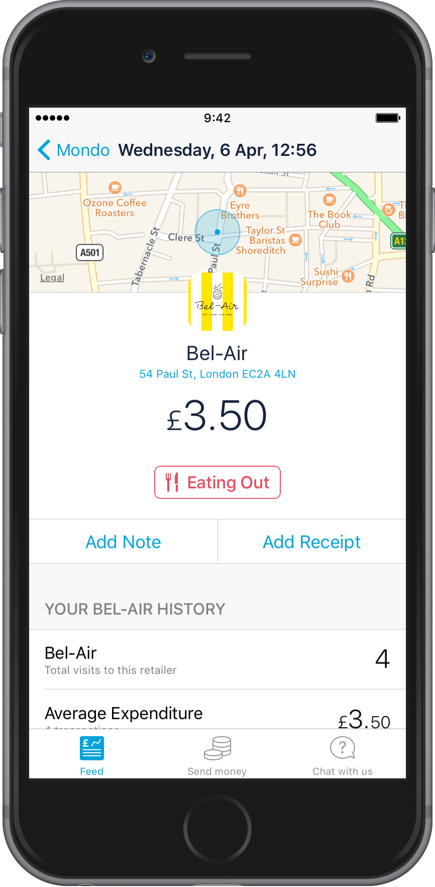
I can’t show it off very well (I might edit a screenshot later to remove private info) but even the contacts / payments without photos are hyper-bright!  I think Monzo should tone their colours down, back to the original scheme!
I’m really interested to see where the community stand on this though I’m going to stick a poll under this, vote on how you feel about the new ‘improved’ colours 
- I love them!

- I don’t love them!


0 voters


 Nobody wants to look at the logo
  (kidding
  )
)


 The selection icons are now square, but the icon for the category in the transaction view is still round. Why the change? Do they need to be different? A small thing, but one of those little details that irks me a teeny bit