Coral metal card inbound.
1 Like
Woke complained about assuming gender.
5 Likes
We don’t talk a about Uncle David anymore.
5 Likes
Best. Name. Ever.
3 Likes
Oh no, the latest Android update seems to have broken the long since fixed issue with searches not respecting the scroll position (i.e. going back to the top of the list on clicking back). Oh woe is me
I hope this new feature is super enough to rebalance the karma
2 Likes
Loving the excitement! ![]()
As soon as we’re ready to share, you’ll be the first to know ![]()
18 Likes
a fix is coming! Thank you for reporting
9 Likes
A super thanks from me Emma! ![]()
1 Like
I use Nova Launcher and for some reason this weeks beta has caused the name of the app to become the name of the launcher activity (co.uk.getmondo.splash.SplashActivity). I can manually change it but I am not sure how this happened since it seems to have only happened to the Monzo app.
1 Like
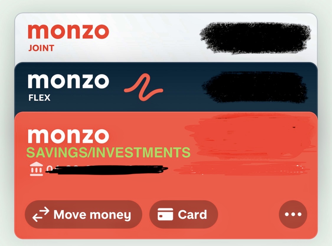
Instead of Monzo having the little boxes at the bottom of the main app page for savings and investments. Can we have another account bar at the top of the page with “Savings / Investments (with the option to hide balance) I think it would look better with all accounts bulked together. Current, joint, flex and savings
1 Like
Such an implementation, to me, wouldn’t make sense.
The Current/Joint/Flex accounts are spending accounts - where you need to instantly see what you have/what you owe - and so make sense to be shown as cards in the card stack.
But Savings & Investments are where you put money to forget about it. The more you forget, the more it grows. So if you ‘hide’ it (as per the current implementation), it’s not as visible. If you put it front-and-centre, users will see it and potentially react with “Oooh, I’ve also got this extra £xxx” and withdraw it & spend it. Not the greatest financial UX
9 Likes
A spotlight for Savings and a spotlight for Investments are currently not available.
Although, if they were, it’d take a swipe down to access the spotlights and then potentially another swipe left to see them (depending on how you order the spotlights)
Whereas one controlled swipe down gives you the same visuals right now.
Some of it might be to “forget about”. But not for everyone. We have short and medium term savings in Monzo - long term is elsewhere for better savings rates or as a joint SIPP.
The current “Savings and Investments” section, keeping savings pots out of sight and sole/joint combined, has made Monzo harder to use for us.
1 Like
True but realistically we all know we have a savings pot/account. If we want to “forget” about the money it’s best being locked for a fixed period which shawbrook and other savings banks who partner with Monzo do. I just like all my accounts to be in a list form or in sections like nationwide. I just don’t like how Monzo have little boxes all over the app - it’s very child like with how it’s all laid out. Even the cashback is at the bottom of the app.
Or even just the option to move the boxes around the app would help. Or delete boxes I don’t use.
I was simply suggesting it would look better all in a drop down menu. Just because there accounts already doesn’t actually mean the functionality is an account. Just something similar to how the accounts are…. Maybe a small bar across to divide the spending accounts to a mortgage account? Like how it’s set out in Nationwide? My point was I just like to see where all my accounts and finances are rather than scrolling to the bottom of the screen or clicking tabs. Could even go back to old Monzo where you scrolled across from different account?
Well, well… ![]() Freemium Black coming
Freemium Black coming ![]()
8 Likes
Access granted
2 Likes
@davidwalton In your latest teardown you’ve shown that ‘background customisation goes live’. Do you know where that option is in the app? ![]()
I’ve not found it, or how to activate it yet - Android. A flag in the last teardown showed it as being live, but there may need to be a certain (upcoming) version of the app to actually allow control of it ![]()
1 Like
I’ve had a look everywhere on iOS but can’t see it. Thanks for getting back to me, hopefully it’s customisable soon ![]()
1 Like