Gold, space grey, lavender; black, chrome, maybe those white red and black bin back cards, then the basketball one I think.
Along with Ultra and then Gold plated.
Gold, space grey, lavender; black, chrome, maybe those white red and black bin back cards, then the basketball one I think.
Along with Ultra and then Gold plated.
I didn’t jump on the HSBC HK card trend when it happened here, but that’s one card I would enjoy having.
Shame they don’t do a different colour version for their Premier account. The card in black (or purple) would look great.
My account is still open but it logged me out and I’ve no clue how to get back in it so ![]()
![]()
I still use my HK account fairly regularly for Steam. It’s capable of making Thai QR payments so I can change my Steam country to Thailand and get cheaper games from developers that do region-based pricing. The card itself… doesn’t see as much use.
Yeah, would love the card but opening a bank account in HK is a bit too far on the scale for me.
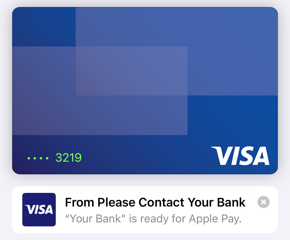
Here’s a fun one: I think is the first time I’ve ever seen the generic Visa design make it into a production environment.
That happened to me once with Barclays. I readded the card and the issue fixed itself!
Amex US teased a new card lads. There’s a full video of it.
Looks like a metallic one. Maybe the rumoured one between Platinum and Centurion.
I have a sneaky suspicion that the effect would look very similar to Revolut’s metal chromatic card.
Can’t find a photo here so here’s one on Reddit
NatWest group has a very strange inconsistency with its card designs. The two on the left on the same, but the two on the right are a different colour each. So I have 3 different shades of purple.
That’s very nice.
I do still wonder why they’ve gone with that design for their credit cards. It doesn’t really match anything else with their branding. Their debits cards do make sense at least, even if some think they look too childish.
The brown is not good
It looks grey to me, not brown.
It looks brown for me, I’m curious to see how it will look in reality, if it’s brown.
I can see what you mean by grey after staring at it, but it looks more brown in that picture imo.
was the dress blue and black or white and gold?
Thank you for this!! ![]() Manifesting
Manifesting ![]() I have soft spot for me luxury magazines and printed materials like that!
I have soft spot for me luxury magazines and printed materials like that!