I’m not a fan as you can see the stuff on the back of the card. It just looks messy.
2 Likes
Yes, that I’ve noticed. Unfortunately Barclaycard didn’t quite think that through when they came up with this (or maybe that’s why the opacity was relatively higher on this card; I seriously couldn’t tell it was translucent until I held it up to a light source).
It is. (You can see the US customer service number through the other side of the plastic) This was originally marketed as a low-interest low-fee card (when it was first released, it only charged 8% APR on everything, 1% FX fee, US$1 cash advance fee, no balance transfer fee, and the FX fee was eventually scrapped altogether) and I kept it as a backup source of cash while traveling, tucking it away somewhere in my luggage to use in case my wallet was stolen or my other cards were blocked.
1 Like

To some degree, it did. There was a community board, like this one but less developed, where people were encouraged to engage with Barclaycard staff and each other to come up with new ideas, with a few things set in stone- I think “no rewards” wasn’t going to change. Some changes in the terms and conditions were also put to a vote- for example, when people mentioned they wished that there wasn’t even the 1% FX fee, it was suggested that to make up for the lost profitability, that the cash advance fee be raised to a fixed US$3 instead and that was put to a vote (no FX fee and higher cash advance fee won). Those were then the terms that applied to new customers going forward. It was a neat idea, to be sure, but then Barclaycard lost interest in all of its own-brand cards in the US, including the Ring, so the “crowd-sourced” aspect isn’t there anymore.
2 Likes

Just picked up a new Tesco Bank Credit Card. Got quite a nice matt black design.
I think depending on what card type you have you can get a different colour - mainly matt blue.
1 Like
I just really find the Tesco logo ageing by this point. Not many companies haven’t updated their logo in so long!
2 Likes
Honestly, at this point I find it refreshing to see a logotype that isn’t just a bland, generic sans serif.
7 Likes
You had to send me down a rabbit hole!
2 Likes
I’ve noticed this trend too.
Other examples which jump out at you are the fonts used by the Guardian newspaper and BBC graphics on the news (a serif version of the BBC Reith custom font).
It seems that people have got bored of the plain-looking, clean fonts. A font with more “personality” now seems in vogue.
Even Apple’s San Francisco font is less sterile than the shades of Helvetica they used to use, although it would probably still be considered to be a fairly simple and inoffensive font that is quite similar to Helvetica.
Edit: Bringing it back on topic, that Triodos card looks uneven to me. Probably because of the lack of tipping on the embossed numbers. Personally, if the numbers are not tipped I think embossing looks wrong. It would be better to just print the numbers or put them on the back instead, in that case.
4 Likes
Wait isnt that the desgin for the Tesco World Mastercard Closed to new applicants since 2005 but my grandparents still have one and it looks like this but says world next to the mastercard logo. (Used to until the interchange caps came in have a higher point earning rate outside of tesco now its the same as all their cards)
My Tesco credit card is the retro clubcard desgin as its a old card.
1 Like
That it is!
Starling cards are now made of 75% recycled plastic!
6 Likes
Quite a good conversation happening over here about this particular Starling card news:
2 Likes
Got a new Starling card today. The design has been subtly changed…
Old:

New:

‘Word Debit’ has been added, the contactless symbol has been moved from the back to the front of the card and the Mastercard logo has been updated to their new textless one.
Interestingly, the card in Apple Pay has also changed…
Old:

New:
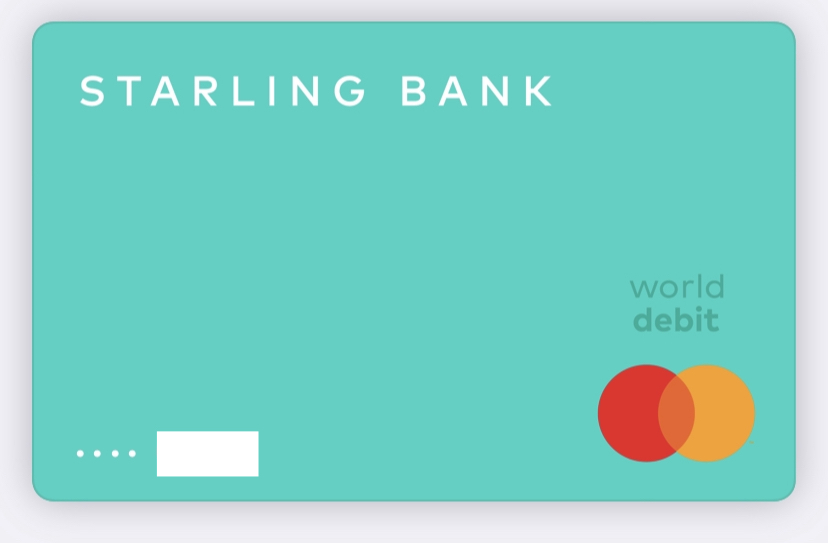
I can’t say I’m a fan of the chunky new text. I think it looks a bit like a toy card, but I can understand why they’ve done it. The old design was dwarfed by most other bank cards’ logos in the collapsed view in Apple Pay

4 Likes
Yes. Neither the contactless symbol nor the ‘world debit’ bollocks is necessary. OK the former might have been relocated after feedback, but, seriously, who doesn’t know their bank card is contactless these days?
Seriously, Starling, though. Just give us a purple Joint card and be done with it.
2 Likes
The World Debit on the front is unfortunately neccessary under MasterCard rules and Starling isn’t going to miss out on extra interchange just because people don’t like seeing it on the front of their cards.
2 Likes
Is this a new rule? As far as I’m aware, Starling cards have always been Word Debit (my old one certainly was), and yet have never featured this branding on them.
3 Likes
You can rebin a card product (basically change all of your cards from standard to world MasterCard’s) and you don’t have to send out new cards but after a set period of time all new cards have to have the branding (the time period varies by country and in some countries like Canada, you’re not allowed to rebin at all under MasterCard rules)
1 Like
As I understood World Debit has only been used in the U.K. vaguely recently (last couple of years). Before they just had standard for debit MasterCard, and WorldElite for premium (and probably others for niche uses). World Debit was used elsewhere in the world and was introduced here and gives a better interchange in return for banks making certain commitments over and above what they legally must for customers or providing more features than bare minimum.
1 Like
Speaking of extra interchange, I wonder how much more it is. Domestic interchange is still capped, UK->EU interchange was raised but I thought the new 1.5% applied to all tiers, in which case all that’s left is spending far abroad.
2 Likes