Pretty good!
I don’t think I like the navy colour either: I’d like a brighter, fresher palette. I do like the colour depending on plan idea, though. And hot coral us actually very underused except for the cards. Another need for a coherent brand!
Pretty good!
I don’t think I like the navy colour either: I’d like a brighter, fresher palette. I do like the colour depending on plan idea, though. And hot coral us actually very underused except for the cards. Another need for a coherent brand!
As @simonb simonb has already mentioned the design team intended to do a refresh, I’m pretty sure I recall reading somewhere (either a report from a Monzo open day or something similar) where a Monzo staff member (designer?) was speaking about Monzo’s ‘brand’ and they said they wanted to try and move away from Hot Coral.
I wish I could find the source article/post, but have been looking for a good half hour and drawn a blank. It was well argued and made total sense, even though I ended up vehemently disagreeing with it 
The nutshell of it was that Monzo had an official brand design/colours and Hot Coral wasn’t part of it, therefore Hot Coral should be phased out and those elements made consistent with the rest of the brand instead.
It should go without saying that (Oh, wait, I already said it in the first paragraph) I am 100% in Camp Hot Coral and think the answer is the come at the problem from the other direction and make Hot Coral official instead, but it really was interesting seeing the other view. Probably true to say that there’s more than one way to skin a brand.
I do miss my coral card a bit.
It’ll be interesting to see what cards feature if they do more generic/broad advertising again.
Interesting!
I don’t remember this (although that doesn’t mean that it didn’t happen of course) - although I do remember something similar about the M logo.
Maybe a big rebrand and be done with it?
(My preference would be to embrace the hot coral and the M logo, but updated so they’re fresh and work in tandem - but what do I know?!)
I just checked for a Plus one on iOS and am now disappointed 
Beautiful!
Update not showing for me yet on the app store.
Not showing for me either on iOS
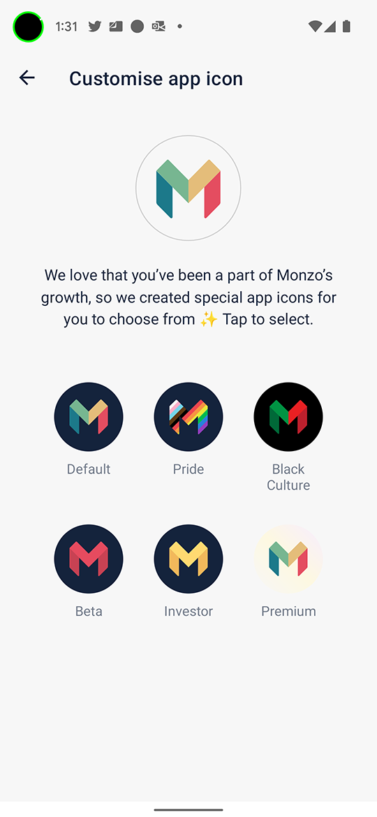
It’s interesting that the Beta one is different colours across iOS and Android, iOS is green
Did it give you graphs in Trends? 

It’s on iOS TestFlight
Not yet - trying to force that one!
Ahh silly me, forgot to update TestFlight today!
We have a Plus one on iOS - It’s the same as the Premium one @davidwalton shared, i hoped it’d be blue
Photos of the Plus one please 
It’s the same as @davidwalton’s Premium one which is disappointing

Doesn’t have the border when you actually apply it on the homescreen