Just sent a payment and set up a standing order for it and I got a red dot on the home tab. I scrolled up and down, tapped on everything tappable but it wouldn’t go. Had to hard close to get rid of it
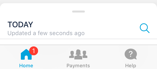
Screenshot for all the red dot fans 
Just sent a payment and set up a standing order for it and I got a red dot on the home tab. I scrolled up and down, tapped on everything tappable but it wouldn’t go. Had to hard close to get rid of it
Screenshot for all the red dot fans
Have you checked the notification bell?
This happened few times for me. Have to close the app and restart it again
Yep nothing there
By the way if you get the Monzo Plus, will the Card colour changes in Monzo app or not
I got the £3 subscription. In case if I want to add travel insurance in the future, how do I add it. On Monzo Plus in app option it’s no longer showing up for me . 
Long press for account list, tap the one you need. Quick swipe to go to the next one.
The idea was you could go < for credit cards and > for savings. Long press for a list.
Anyone know how to force update the pot amounts? Have no idea how much money I have in my account overall
Click withdraw or add and then back out, seems to do it for me.
I did try that but it doesn’t work, having the total balance removed doesn’t help as it looks like my account is simply losing money without going anywhere
Edit: seemed manually adding to the pot (rather than IFTTT) seemed to update it
One of the first things I did when I was trying to see what’s hidden behind the feed was tap the card. It didn’t do anything, figured out that I had to pull down the feed but that wasn’t my first instinct.
I think it would be good to have the feed move down to reveal the card options when tapping the card.
I also think the new interface may need or might benefit from a first use introduction. A lot of things have moved around and it’s not immediately obvious what’s what with some of the new peices.
This looks like a good solution. I’m trying to new version and really missing the budgets/left to spend that used to be in summary.
I’m assuming these would be coming back for Joint Accounts too? I hardly use my personal account.
Thanks for the great work 
if your using the latest version on TestFlight (2.45.0 (522) on iOS.
click on the left to spend icon and it should bring up up the summary/budget feature you know well.
Something like this. 
This pot update delay is really starting to annoy me, Monzo knew it was there before this new look update so should have fixed it but no instead they still let it appear in the new look.
No excuse really
Sooner the pot(s) issue gets sorted the better not having the balance update is really annoying/frustrating and should be solved as they are pretty useless at the moment.
I’ve just recently created a joint account with my partner.
But I’ve noticed with the new layout. I’m unable to see the joint account? 
Where my partner can see if fine in the old layout. 
That or I’m being blind. 

Plus upon clicking go back to your account the app crashes. (Screen below)

Press and hold on the bottom bar for the joint account switcher.
Well thank you very much! 

 Teach me not to do a search 1st i guess.
Hi Bruno, please can you fix the pots bug in which the Investec details have completely disappeared. My investec pot is showing as a regular pot and the investec logo has vanished as too has the interest awarded. Also in the joint account the option to open a savings pot has disappeared. Thank you.