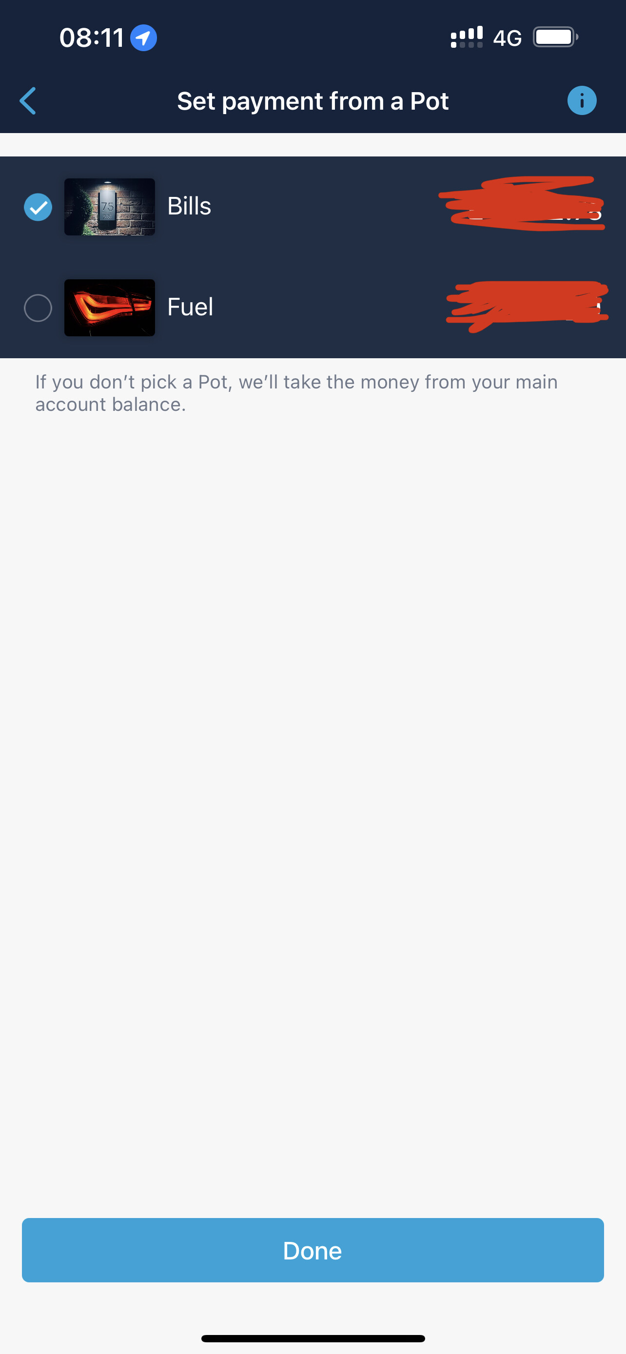
Lots of white space in the pay from pot selector.
2 Likes
It’s the merchant feedback screen so naturally this hasn’t been updated 
16 Likes
My own small contribution to de-snagging
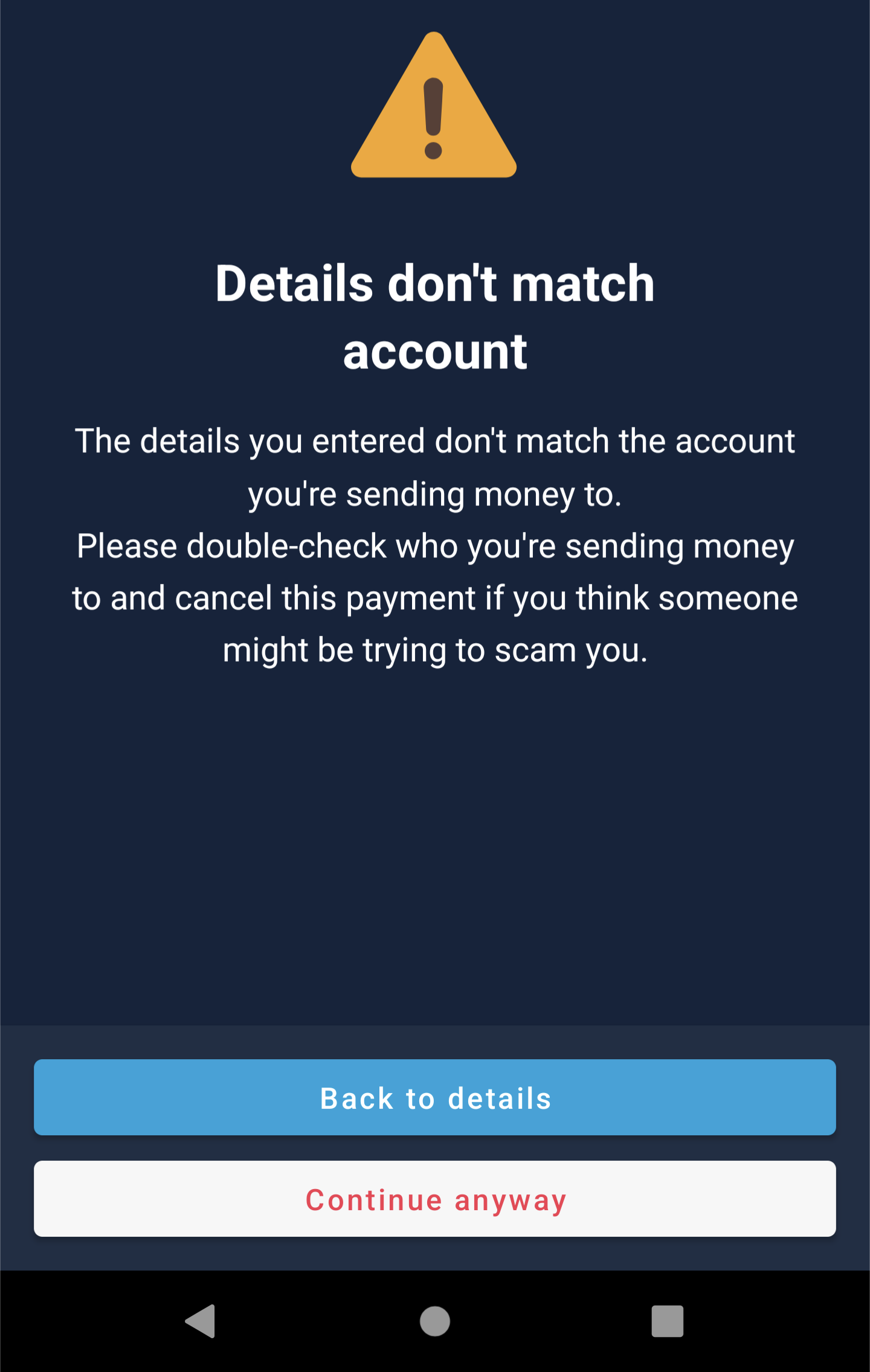
On Android 12 the buttons for accepting a faster payment despite the details not matching - do not worry, they are actually the legit details for my window cleaner - seem to be those from the light scheme:
Freezing and Unfreezing my (Plus) card on iOS in dark mode causes a white screen flash - not sure if this is intentional? Seems a little off putting if so.
1 Like
Does not work for me either - I’ve always had “Dark Mode” on my iPhone enabled, latest version of both iOS and Monzo. I even see the message within the App that the “Dark Mode” has been enabled, but nothing.
Try force close the app once you have enabled dark mode and re open the app. This worked for me.
Hi AaronF and michaelw90 - I had already tried both things. I think the issue came from me having queued the update as it came, but never ensuring it had gone through. All good now, it was a classic “user error” from me!
Glad you got it sorted !
Loving Dark mode ! 
1 Like
I’ll switch it once it’s native to the app, and not full iOS system because I can’t deal full dark mode, but banking apps look a lot better on dark mode.
Please make it black 
1 Like
Was excited to try this activated it not working I’m on iOS 15.3 spoke with monzo CS and they asked me to log out and back in app still not working now it’s been raised again  hopefully can try this soon!
Do you have global dark mode on?
You need to change your iPhone display settings to dark mode, so the whole phone does dark mode, and then activate it in the app and it should work.
1 Like

Looks good. I recently worked on implementing this for another app recently! Would be nice to see accessibility improvements by taking advantage of the high contrast accessibility options in the colour palette but looks like a great first edition.
1 Like
when I submit a merchant correction (I know, I know), sometimes I get a dark page “thanks for your feedback” and other times it’s a light version of the same page, whilst in dark mode. Somehow there must be two ‘thank you’ pages doing the same thing but for different merchants (maybe).
1 Like
really like the dark mode … well done monzo 
2 Likes
I agree, it’s not ‘lights-out’ dark mode but I think it is VERY well done.
Especially on Plus/Premium accounts - while I appreciate some people don’t like the purple gradient, I think it looks absolutely class.
The power saved by absolute-dark-mode vs retina-searing-#255#255#255 is negligible. Regardless of an app using dark mode or not (most do now, and I use it wherever possible) my phone lasts just as long now as is did when most apps didn’t do dark mode.
3 Likes
I wonder how they came to the conclusion (or the subject was broached) to use purple instead of traditional black.