Now that we’ve released Mondo for Android 0.1 I think it’s time for us to share with you how a full fledged 1.0 could look. Allow me a disclaimer though, this is still very early stage, our 1.0 will probably be much smaller in scope
As we do on iOS we’re committed to deliver a world-class Android experience, built on top of the excellent platform conventions of Google’s Material Design and sprinkled with a bit of “Mondo love” whenever we need bespoke elements.
We take Android seriously and last thing we want is for you to feel that the app is just a “port” or second-class citizen compared with the iOS version. That’s why we’re designing everything from scratch. Even the new features (like the amazing new search that @anon173672 shared two weeks ago) have been already designed multi-platform
Said that, let’s go to the pretty pictures
First thing you’ll notice is that we’re considering a classic drawer navigation + floating button for feed related actions. Even though Google recommends Bottom navigation we think this pattern may work better for us and reduce complexity on the top dashboard area.
Another big section is “Your spending” where we’ll take advantage of motion and colour to drive the attention while browsing each group. We’ll do cool stuff like opening transactions as bottom sheets, so you can quickly take a look without losing the context of your previous aggregation.
Of course there are many more screens but I hope these few could at least give you a glimpse of the direction we are following and exactly where we are the moment.
Generally, looks great! I’m particularly glad you’ve gone with the hamburger menu/pull out drawer, a tab bar never feels right to me! If you haven’t already seen, several Android apps animate the hamburger icon into the back button (at the expense of the drawer being under the top drawer, which I’m 50/50 about), which looks amazing!
I’m not so sure about the + FAB though. I think its a great UI tool for ‘adding things’, but I personally wouldn’t expect top up or send money to be there. Without having used the app, I think I would expect Send Money to be in the drawer and top up to be up in the action bar, next to search.
I like the hamburger menu I think it will look better once Mondo starts adding more and more features and things such as direct debits in the future. Will this be coming to the iOS version?
I’m also not too sure on the + button, just does not feel like it should be there.
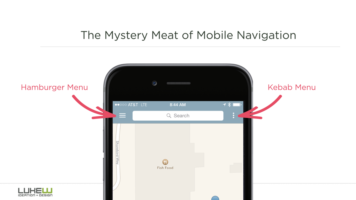
The “kebab” menu as you’ve called it (delightful! ) is used to perform contextual actions on the current screen, whereas the hamburger menu is for changing the overall state of the app - more like a tab bar.
That being said - it may be worth considering a tab bar within the Android app. Google’s UX guidelines now include them, and the benefits over the hidden hamburgers are well documented. That doesn’t help if it doesn’t act like a tab bar like on iOS though…
I am in the group of “I seriously hate material design”, it does absolutely nothing for me, but I will try and be constructive.
I like the UI @hugo so far, except the side bar and the floating button, but thats Googles recommendations, but I wish there was a nicer option.
The second image 1st and 3rd/4th screen designs look nice - in someways nicer styling than the iOS in my opinion - the 2nd screen design is so unappealing because of the red header and undefined sections.
Personally I’m a big fan of the nav drawer. It is great for navigating between different sections of the app. Personally I prefer the drawer to overlay everything (including hamburger icon). When it’s expanded it should be the main item in focus to the user. When it scrolls under the toolbar it doesn’t feel like the main focal point to me. I’m not sure on the FAB though. I can’t work out what it’s purpose would be on that particular screen [Edit: I now see it’s purpose. Still not sure it sits quite right there. Just an opinion]. It does have its uses and looks nice, but there is a time and a place for it.
It is great to see proper research into the design guidelines is happening though - I am a fan of both cards and chips. Maybe cards for transactions and chips for categories? Either way, it looks good so far!
I don’t think the floating action button works in his case. It makes it look too busy.
Personally think it would be better to move the top up card and send money options into the nav drawer if your avoiding bottom navigation. Otherwise looks great!


 I think it will look better once Mondo starts adding more and more features and things such as direct debits in the future. Will this be coming to the iOS version?
 ) is used to perform contextual actions on the current screen, whereas the hamburger menu is for changing the overall state of the app - more like a tab bar.