With all the talk about pots, swiping through them all, different ways of viewing them, the info that needs to be shown when viewing… it makes me think that they are trying to do too many things, so the way they are shown works for some use cases but then really doesnt for other use cases. It might be that Monzo actually need to re think pots and what they are intended for.
It’s a nice way to switch between accounts but I don’t need all my pots there.
I don’t really need to see my pots at all. Now they are a bit of a nuisance.
I’d prefer them a bit more hidden away.
2 Likes
I agree with this, I also prefer the ‘view all’ page listing account and pots vertically when I do want to look at pots, as I can see more pots at once and their current value.
I agree… moving from the horizontal scroll to the vertical listing of pots in the current version of the app a few months back was a big step forward, this definitely feels like a regression.
I switch between my sole and joint accounts multiple times a day, and that currently only takes one (long) tap.
2 Likes
Can we see the pot names when scrolling horizontally through them? I’ve got a bunch of pots and trying to remember which is which can be confusing 
This blue background is being removed as mentioned by Bruno in an earlier post.
Having trouble finding said post though!
1 Like
Apologies if this has already come up but I figured I’d leave my feedback. All using Android.
TLDR: It feels quite unfinished
- I don’t mind the swipe to navigate between accounts and pots but if I have a lot of pots that’ll get old. I can see that if I had multiple accounts with the pots for each it might look more intuitive but I don’t have that so it’s just extra fluff.
- The summary panels beneath the main account and pots show different things. Despite having the same mechanism to get to them. To see the same information for pots I have to click history, which leads me to:
- The four buttons are in the same place and look very similar in pots and accounts yet do completely different things so I have to really think and look before pressing as what they do might have changed.
- Quite whitespace heavy. Though this may be intentional I would like to see more than two transactions when opening the app.
- Scrolling on the transactions/summary pane seems clunky. I think because the sliding panel contains a sliding list and the logic isn’t quite there to figure out what I want?
- No “Spent today” (in various currencies, which I love)
Now a list of things I think may be due to unfinished stuff
- Weird blue boxes around things?
- A permanent account number that I’ll use once in a blue moon.
- Pot? Not Coin jar or whatever I’ve called it.
That might be because it is!
9 Likes
Oh, granted. It’s just there’s talk in this thread of “almost there” etc.
I largely like the new nav.
For me though, there needs to be a way to ‘jump’ back to your feed - I would think that tapping home would do that (scroll back through your pots back to your main account feed)
I get what others are saying about account number etc being prominent, though I quite like it - especially being able to copy S/C or Acc# individually!
I access my pots ALL THE TIME, but I kind of agree that the swiping and showing all of the pots is a bit much. Perhaps we could have ‘featured’ pots that we access regularly? Like ‘Weekly spending’
On the ‘view all card’ button, it opens all the pots for both accounts - amazing, and it’s so much faster…However when I first used it I was a little confused how to get back to my account, I expected a ‘X’ in the top left, since it’s a view ontop of the nav layer. I know you can tap the account to jump to it, but I’d also like the ‘X’ to make it easier to navigate.
I echo several users request to see a ‘feed’ for your pots - It’s good to see what date/days you added or removed funds from a particular pot, and the amount.
Overall, big improvement but still a few more tweaks to make it  !
!
3 Likes
This, I don’t need all the pots at the same level as the accounts, it’s now way too busy. I also liked being able to switch between accounts, essentially knowing I was in joint or solo account ‘mode’.
I don’t need to scroll through pots that often, this seems to be a backward step.
I’ll also have to add, the summary and budget aspects make Monzo for us. If they go, we go.
1 Like
 Has anyone tried the latest Android Beta? Thoughts?
1 Like
Looks fab!!
New summary button and view all has gone.
And account settings/profile accessed by clicking your profile.

Everything feels slicker and faster too.
3 Likes
Love that the top status bar (with the clock and stuff) is now grey/transparent! Can the bottom nav bar do the same?!
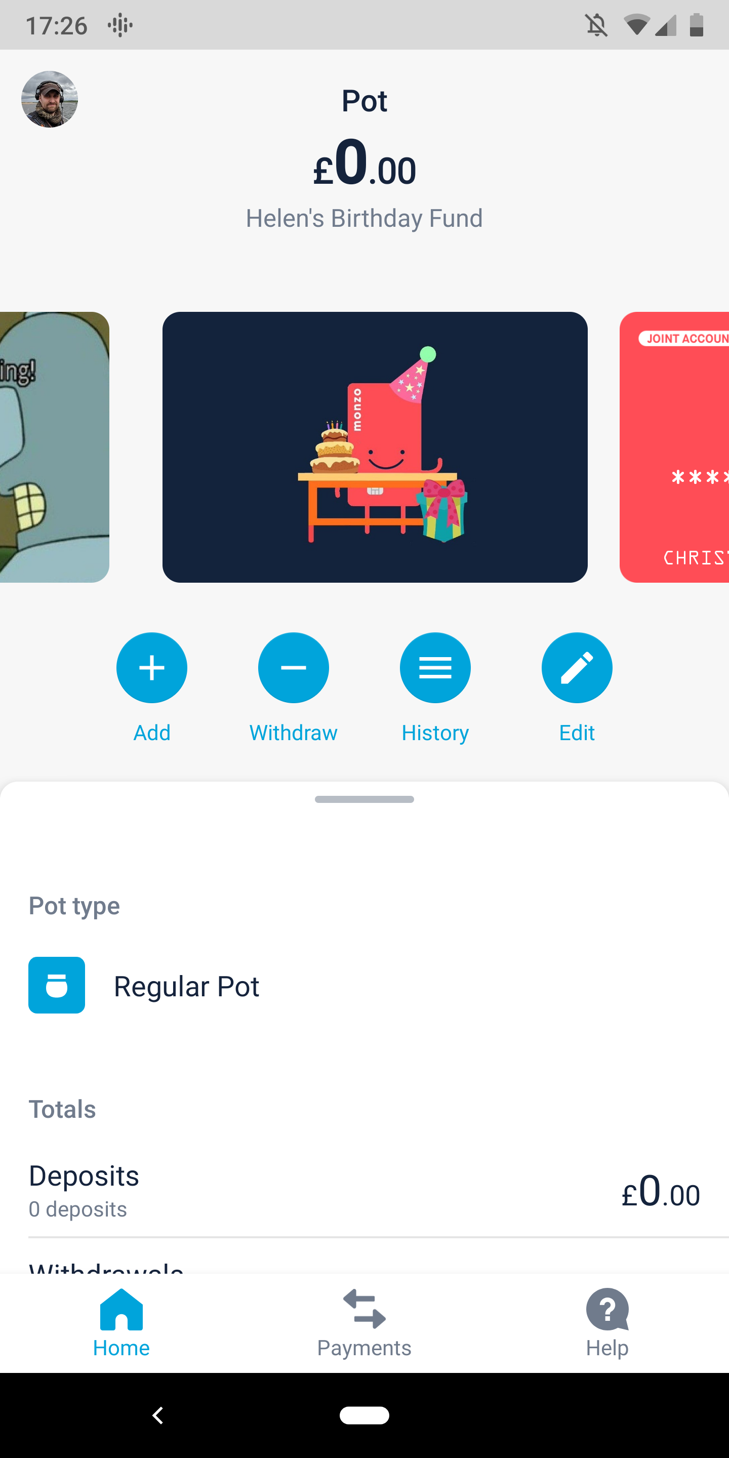
Feel like the pot name should be at the top in bold for this reason though?

Also, goals seem to have vanished
Tapping the card when the transaction feed was lowered used to put it back, now you have to do that manually.
When sctolling sideways the pots are still all titled ‘pot’
Left to spend still missing…
Other than that, it’s a definite improvement.
One thing I would say now is some of the navigation is getting really deep. To get to settings now is tap on your initial -> tap on your name -> profile -> settings. That’s what’s required for example to switch fingerprint auth on and it’s not the kind of thing you’d find accidentally.
Pretty nice. No complaints from me. Only that there is no left to spend bar on the main screen/card view, although this is still to come?
Clicking “Monzo Plus User” underneath my profile takes me directly to the Monzo Plus manage page of the app - nice. (Not sure if this worked before only just noticed).
On my personal account when scrolling through the pots, my card still appears behind the first pot but when scrolling onto the second pot the card disappears.
This doesn’t happen on the joint account.
!!
1 Like
I’m definitely not a fan of the Summary being behind an icon to click.
I loved the line under the balance to show your summary, I hope I’m right in thinking this will return when they’re figured out all out 
Also not sure why swiping down opens the old list of pots… Confusing.
When I open the app, to me it should always open by default to the main monzo card, but when I open the app currently, it shows the last card or pot when I left, I then have to scroll to my main account, which is frustrating.
The daily spends isn’t showing, even though in an earlier post it said that it would be back.
As shown in other posts, the word ‘pot’ is being shown above the pot total, even though the pot name is shown under. Not sure if this is meant to be like this to signify that it’s a pot, but I am aware !
The blue pill is still being shown with the account number and sort code, I understand that this is to show it’s clickable but why can it just have a line under or a box around with no fill, does it really need anything at all. To me the blue pill just looks out of place.
2 Likes