Love this.
2 Likes
Can we unpack this a bit?
I’m assuming you’re broadly on board with the concept and what we’re trying to do here (all the stuff in this post) but that it’s how we surface that in the app that you worry over?
On the flash poll, did you vote no because it’s too busy or because it’s genuinely confusing?
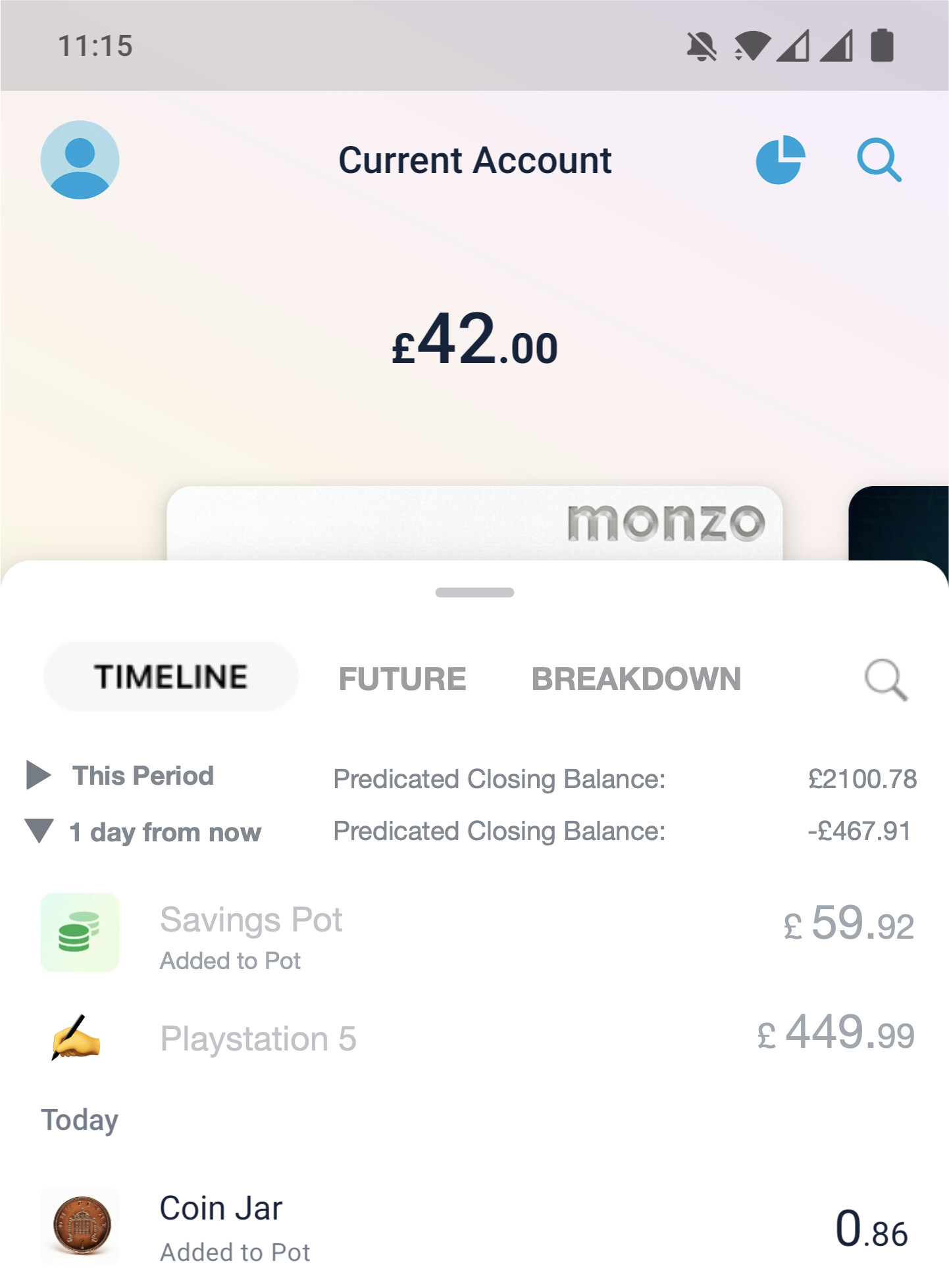
I think I see what you mean here. Is it the text? My app currently look like this:

I think the only (fundamental) difference is that there’s the triangle to hide these transactions - is that a bad thing? Or is it the fact we’ve duplicated it to show the rest of the period’s transactions? I’m thinking as I type, but I wonder if we lost the explanatory text (“Predicated Closing Balance”) and thought about a more elegant way of hiding/showing the future transactions (perhaps a pull down/up gesture could reveal them? ![]() ) would that be better? Or do you fundamentally think future transactions don’t belong on this screen?
) would that be better? Or do you fundamentally think future transactions don’t belong on this screen?
Sorry for all the questions - I’m not challenging you, just trying to tease out what’s not working here!
One last thing (and I should have probably said this up front): I’d be very up for fundamental changes to the app. I’m trying to do these mock-ups as marginal tweaks to the current app, though, otherwise I think they tend to require much more explanation and can be difficult to follow. But I do get the point that sometimes going back to first principles is the better approach.
1 Like
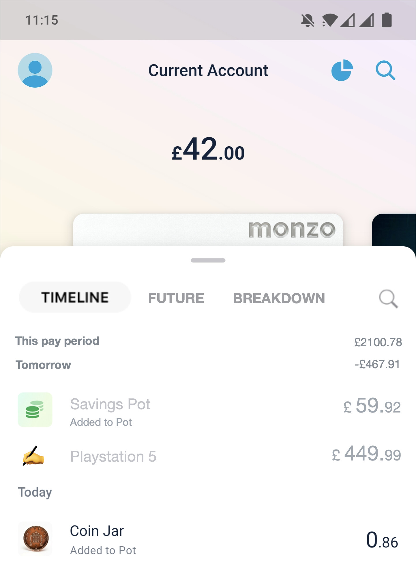
I’ve been having a think. How about this as an alternative?

In this version, the ‘tabs’ live in the upper section, so the transaction list by default covers them. I’ve kept a summary of upcoming spend for tomorrow, but without the detail, so it’s slightly slimmed down from what we currently see in the app. But I suppose you could also get rid of that too.
Something funky that might be a possibility: swipe left and right on the feed to move from past transactions, to future transactions, to a breakdown (where you can see spending insights by merchant or category etc).
3 Likes
I’m not 100% with N26 but definitely somewhat agree with what he’s saying.
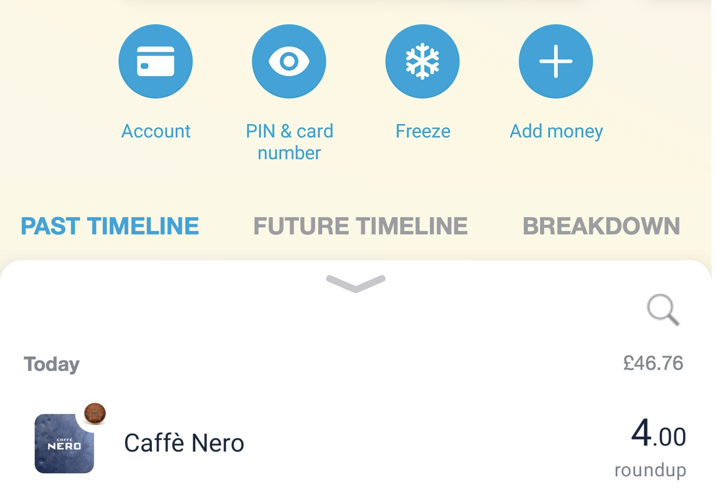
I think this ‘above tab’ option feels a bit better!
2 Likes
Flash poll! Which version works best, do you think?
-
Version 1a: Collapsable sections for tomorrow’s transactions and this period’s transactions on feed screen.
-
Version 1b: As version 1a, but future transactions are in summary only - go to the future tab for individual transactions
-
Version 2a: Tabs are under the card controls so can be hidden. Tomorrow’s transactions shown in summary only.
-
Version 2b: As 2a, but a strict separation between past and future transactions.
- Some other combination (explain below please!)
0 voters
Edit: user error, poll rebooted, please vote again! (cc @Alexxxxx) 
Thanks for all that - super useful! Any views of the alternative designs? Do they work better for you?
So I’ve had a go at what that might look like in Monzo. It’s kinda hooked into the previous designs, though - but hopefully it’ll make sense when you see it:

![]() Disclaimer: this is all made up. I don’t work for Monzo!
Disclaimer: this is all made up. I don’t work for Monzo!
If you’re up for it, could you expand a bit on this? I like the idea but am struggling to visualise what it might look like. (Spoilers: my current thinking is to repurpose the Summary button top-right for insights, breakdowns and graphs. Then the ‘breakdown’ tab for stuff associated to an account (if you remember it, the (very very) old Spending tab before Summary was a thing, that gave a breakdown by merchant etc).)
So many ideas! Probably for separate discussion (and let me get this stuff out of my system first!) but it does seem that the design system has evolved over time, and that it’s not really that consistent what goes where. The new design (swipe-able cards replacing pulse) was meant to fix that, but I’m not so sure that it has. I really don’t think my design skills are up for the task though!
I don’t think the feed should be called the ‘Home’ tab, though. I think there’s an argument for a beefed up Accounts tab to have that honour. Or just to avoid promoting one tab over another, and for the app to load up on whatever the last tab selected was…
3 Likes
So I think with my previous comment I should have been 2a, but I have thought more and gone with 1b now 
1 Like
Absolutely. And lest anyone from Monzo is reading and grumbling at me, I really don’t think that anything is bad! I just wish that it’d been iterated a bit.
For me, two big things jar: the accounts screen is super important, yet I’m not sure it’s discoverable enough. And secondly, the skeuomorphic card interface doesn’t really work. It centers the app around cards rather than accounts (which is partly why virtual cards don’t work where they are) - I think I’d prefer to be able to upload an image (like with pots), but would need to think about it properly.
I also think there’s a whole bunch of minor things that need fixing (like the balance not being shown when the transaction list is full screen). And that’s before we even get onto the horror of the bottom tabs!
I like this idea. I shall make it so.
Edit: I have made it so:

Thoughts on what to call what I’ve labelled ‘Breakdown’? I’m thinking it’ll contain lists of spend by merchant or by category for a given period.
AMAZING ![]() (ahem)
(ahem)
4 Likes
This is totally off topic, but seeing your modified Android Monzo pic has reminded me how much the text alignment of “PIN & Card number” looks so off to me on the iOS Monzo app! Such a small, I guess insignificant detail, but to my eyes looks so much better the way it’s done on the Android app 
Android

iOS

6 Likes
Oh my goodness. I see the logic, but no! 
2 Likes
Great thread. Someone in the under staffed Department of Budget Science and Planning Department, get on the 
To sort of capture thoughts as I’ve read from the “new” suggestion post and the comments since;
- I heard the phrase “Safe to Spend” referenced recently here (maybe @N26throwaway ?) - I like the context that brings and I think overhauling future transactions around that concept would be a better implementation than today’s approach.
- Tying things in to the budget makes a whole lot of sense - they are two sides of the same instrument (one is a plan, one is a ledger).
- @davidwalton made some great posts about how YNAB handle future transactions - I’d mirror some of the same sentiment and say the ability to forecast for future spending is really crucial - and not just recurring or estimated spending. An ability to tell the app about up coming spend would really enrich the usefulness of that Safe to Spend data.
- Also, capturing budgetary constraints - if in one month I want to budget £1000 to increase my emergency fund - the app should reduce that Safe to Spend amount (no money has left my account, so in current Monzo terms, that would show up as available, yet it has a purpose so isn’t available)
In terms of the Look and Feel stuff -
- I personally think the Running Balance should be toggleable - I think it can clutter up the view. Maybe that could toggle between the current mechanism of Total Daily Spend / Running Balance by day.
- I generally hold the view that predicting future transactions shouldn’t include future income - or at least, there’s a balance to strike there, and I’d err on the side of not including them in things that can affect the budget. (i.e. if it can artificially inflate the appearance of available cash - don’t do it, if it is a chart specifically for forecasting, do).
There’s a whole world of interesting UI stuff, and app behaviour stuff in all of this - so I hope at least the Team are having a good read of this thread ,
4 Likes
Ooh this is interesting. I have thoughts / comments (sorry!):
Question: when you say ‘today’s approach’ do you mean what’s in the app currently, or the approach I’ve taken?
More generally (and bad the me for not explaining it), I think I’ve been trying to combine and rationalise envelope budgeting (stick stuff in pots) and line item budgeting (the future transactions stuff).
The way that I see it is that if, when you create a future transaction, you are prompted to move that to a pot (or, if it’s a long time in the future, to create a savings plan to put enough aside to afford the item) then you’re getting to a ‘safe to spend’ figure by default. But sometimes you’ll just want to have the money ring-fenced in the main account without physically moving it. I’m calling that the Left to Spend figure (because that’s what Monzo calls it, because legal issues with Safe to Spend).
If we’re agreed we want to move towards a genuine ‘safe to spend’ figure, then I must admit I’m a bit baffled by this. One of the reasons I can’t really use Monzo’s budgeting features at the moment is because it doesn’t effectively forecast income, or money in. Indeed, even if the app ‘knows’ I’ve got £30 coming into the account tomorrow (because BACS), Summary doesn’t ‘know’ that. Expenditure only seems like half the problem - what am I missing here? (That’s not hyperbole or me dismissing it, by the way, just that I feel like I don’t really understand at the moment - and I want to!)
(emphasis mine)
I’ve been thinking about there being four different balances that you’d want to see in Monzo. Spoiler, but I think you should probably be able to tap on the balance and choose which one is displayed. In my head, they are:
- Available Balance: what we have at the moment
- Left to Spend (or Safe to Spend): This is the available balance minus any future transactions.
- Absolute Balance: It really irritates me this isn’t in the app - I think it’s a massive oversight. Basically, this is your balance for overdraft, interest and legal purposes. So would include pending transactions that haven’t been collected yet.
- Budget Balance: At the moment, this is lumped in with Left to Spend, but is logically different. Left to spend is your actual balance minus committed spend; your budget balance would work (I think) in the way that the bit I’ve emboldened in your text suggests - that you set how much you want to spend and subtract committed spend from it. You could lump it in with Left to Spend, but there have been people on here confused about what the balance means, having forgotten that they’d set up a budget, so I think it works better as a separate thing…
2 Likes
Here’s an example:

And here’s what I think could happen if you tapped on the balance:

Under this model, I’d kill the traffic-light indicator from Summary as it’s not needed anymore (and anecdotally seemed to have confused people).
3 Likes
Looks nice. Are these updates going to be released tomorrow or a future date?
![]()
(Just in case it’s not a joke:)
So unfortunately how about never? ![]()
1 Like
With that creative talent well you should be their app developer! 
1 Like
No one should really want me to design apps, let alone code them!
3 Likes
Oooh lots to reply to here ![]()
Sorry - not being clear here - I mean the “current app approach”. I broadly agree with the approaches in this thread, though maybe some slight tweaks/builds!
And I think that makes sense, but like you say in the second quote - it’s not always the case that every budgeted amount is stuck in a Pot. I have previously used pots like that, but mostly as a workaround to a proper Envelope method.
This is where things get a bit hazy - because a true envelope system only needs the money to be, let’s say “virtually marked” as in an envelope, not “physically moved to” it. As long as I’m keeping a record of how much money is “in” each envelope, I don’t need to physically stash it. In the past I’ve chosen to do so because of the limited ability to budget [in the way I want to].
By extension - that also means a Left/Safe to spend value isn’t required - because all the money should be in it’s envelope (or, is waiting to go into one). So… I appreciate that aspect doesn’t fully stack but I’m getting off my track here…
So I guess my thinking here, is that money that has been ring fenced - shouldn’t appear in that Safe/Left to Spend figure. Lets say I keep my Emergency Fund in my main balance (on account of an emergency may happen and I need to get the money quickly, or I’m without internet), I don’t want this to show up in that LTS summary. (Admittedly, I don’t know how this would work in the current in app execution? I believe it would show but I’m not certain).
Obviously some of that is counter intuitive to the Pots system, so I suppose there’s some level of Pot existence that makes sense - but my feeling is Budgeting and Pots would need to be agnostic of each other. [Although again I’m going on a different track but may expand on that later].
I certainly didn’t put much explanation to it - and I agree known knowns (like a confirmed BACS payment) should be captured.
My thoughts I guess stem from a long time use of YNAB - and the philosophy of only assigning money you have on hand to your budget. Ultimately, my budget takes the approach of "what does this money need to do, until I get paid again’.
Knowing that I get paid £1000 in 10 days, doesn’t help my £900 rent that is due in 5 days. Now that becomes less of an issue when sat on savings, etc, but that approach prevents me from budgeting (and spending!) money that doesn’t exist in my account yet. A more common example might be people who work freelance, or have multiple/variable pay checks to balance.
Now I’m not saying forecasting shouldn’t exist - just that I don’t think the budget should include Money I don’t yet have. I think the ability to forecast is something that complements the Budget - but I do think the two should be discrete things.
May be thinking semantics here - but I think it’s a useful distinction… Though I’m not sure all that explained it well!
And I think they all make sense - maybe an additional “Left to Budget”. But I think the “Budget Balance” articulates why future income can be convoluted - it couldn’t include anything future focused or it becomes an innacurate measure. But basically “Budget Balance” being money left after you’ve earmarked all the things you want to earmark?
1 Like
Oh wow, excellent reply - I see where you’re coming from! And I think I agree with most/all of it.
This is interesting. I suppose in my head I was designing for a hybrid system where you could envelope budget (pots) or line-item budget (Left to Spend) - but I hadn’t considered this scenario.
For this use-case I’d be tempted to introduce an overdraft or offset pot. One that physically separates money, but which would offset to work as an overdraft (in the same way that Starling’s does) if needed. (With hindsight, I think that Monzo probably made the wrong decision on treatment of cash in pots for overdraft purposes, but I digress). The alternative would be to create something like pots but not like pots (‘envelopes?’) But I suspect Monzo would resist that as it makes the app busier and it might be more confusing to use.
I see where you’re going here, but I remain a bit sceptical. After all, in YNAB aren’t you planning for recurring monthly expenditure that may be dependent on a salary that isn’t in your account yet?
The way I see this working would be that for the future spend you would select a period to view. Either to your budgeting period (usually until payday like in the app currently) or on a calendar basis (e.g. weekly or monthly) or like Simple with a rolling forward look (I think they use 30 days). For the former ones, I think it would meet your needs as the period would reset when your salary came in; for the latter, that would only really make sense if it predicted income in. And I reflect a bit on some of the feedback from those who had multiple income sources - Summary is completely broken for them, and they’d need a way to plan on a multi-income basis.
I think this is where we might be on slightly different pages. I’m trying to think of this (I think) as an extensible forecasting tool that can be used to budget if you want to. Maybe this is semantics again, but I’m just not sure that you can possibly avoid budgeting using money you don’t have yet. You know that next month you’ll need to spend £xxx on mortgage or rent - whether or not you have the money. And you also know that you are due to receive £yyy in income. Why not see it all in one place?
2 Likes
At this point it feels embarrassing to put such a non-post into this incredible thread but just wanted to throw an emphatic agreement in re this.
I have never been convinced by the ‘simplicity’ arguments and think it’s, excuse the language, a JOKE that I can be charged overdraft fees when I have a positive overall balance.
6 Likes