![]()
![]()
More info please!
![]()
![]()
More info please!
The single use cards were impregnated with small amounts of carbon 14 (which is slightly radioactive) and this was somehow detected by the ATM - probably to prevent people making their own cards! Plastic cards and magstripes came (probably not much) later.
Thoughts?
I think it’s definitely better than their other new designs and is actually quite a nice design.
Wish they’d roll the Kinect app out of the joe public too, looks a nice app and surely can be easily converted to function similarly to basic use not just business.
Taking a look on their website, I would agree. Definitely seems a better app than their normal one.
There’s also this credit card. I like it less than the debit card, but still miles better than their other new cards.
I guess they feel the need to provide a better service and products to business customers opposed to general.
Both those kinetic cards look better than their general offering 
I think the red is better than the black.
The black to me looks a bit too early 2000s business. “Get connected to the superfast internet highway”
I do think that this is another design that would look better landscape though. The landscape designs in the app look better imo.
I don’t use Kinetic, so can’t be sure, but that app looks like it is based off the same platform as the new general personal app, only with a slightly different design over the top.
I agree that it’s more presentable, but it doesn’t seem that functionally different - I bet, once you drill down into sub-menus, it’s much the same.
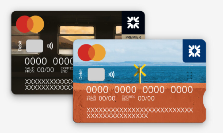
Thoughts? I think this is the first time they have shown their Premier Debit design.

From Your new Debit Mastercard® | Existing Customer | NatWest
It seems that RBS has changed their original design for their new card.
From We're changing to Mastercard® | RBS - Royal Bank of Scotland
Personally, I think RBS cards are a lot better. The images are actually nice. I prefer the train image for the premier account, but the normal account is also nice to look at. 2 good designs I think.
However, I still really don’t like the NatWest design. They both look a mess. I think the normal one is slightly better due to the brighter colours. The premier one just looks depressing. Who wants a card with random stripes of grey on it?
Doesn’t this one have a fingerprint scanner?
I quite like all four to be honest. Perhaps I like the standard NatWest one the least; but the two RBS ones are rather surprisingly nice
Can’t wait to receive my MC card
I preferred the Beach Hut.
Both the beach hut and now these are terrible Google Image stock photographs.
Ah, you went with the random photo on your card account, good choice
The random photo of a child seems standard for all RBS cards displayed in app. I’ve no idea why they couldn’t just show the actual card image
Just put my replace NatWest card in to Apple Pay. Not seen the premier card until now.
I don’t have the physical card yet.
I think it looks quite nice. Did your previous card expire, or did you request a replacement in app?
I found the Ulster Bank design too, with a bit of digging.