imo right for me tbh i like the left one i posted but the right one just seems way more elegant
I quite like the right one more
For a card that is so exclusive, I don’t think either are particularly good looking cards.
(Something a lot simpler would be more to my taste.
Didn’t they used to be plain at one point?
No idea.
Maybe someone more knowledgeable could find an older pic.
I very much doubt I’ll ever be in a position to see one of those cards in the flesh.
1 Like

Most review sites of the centurion card show it blank
4 Likes
Now that’s a nice card, keep the crayons away from it.
1 Like
Nice, but would look even better without the border.
(Yes, I’m a sucker for absolute minimalist cards)
Especially that it’s made from solid anodized titanium aswell
3 Likes
They still are plain, the designs are limited edition and can be requested. Platinum has the same two extra options in the US
3 Likes
[quote=“Ivan1954, post:2220, topic:113314”]
would look even better without the border. [/quote]
That’s the classic Amex design though, even with the updated visuals they have kept that. Personally I approve of the decision not to alter things too much. I didn’t like the updated font at first but its growing on me.
4 Likes
This is a new design from NatWest – a virtual Buy Now Pay Later credit card:
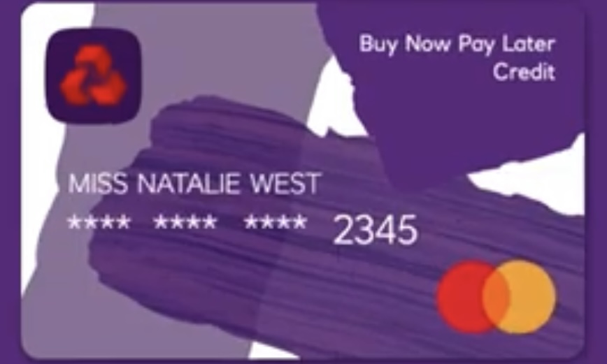
I quite like the brush stroke effect, which is a step away from the block colours of the debit cards.
Does anyone know if the regular NatWest credit card range has been redesigned?
6 Likes
Never heard of NatWest BNPL. Just researched it. 4 Months Interest Free sounds good. Definitely trying to keep up with Monzo
2 Likes
Thats definitely the best version of their new style of card. Their debit card is just too colourful and messy and the one that is black just looks a bir depressing. The purple with the white background looks really nice.
1 Like
I’ve been following this thread with interest for a while, but just joined the community.
I’m hoping Lloyds will refresh their debit card designs soon, I recently opened a Club Lloyds account and the embossed card feels so old fashioned to me, compared to some of my other cards, such as Chase and Virgin Money.
Halifax used to have the worst debit card design in my opinion, but their new cards are now probably one of my favourites.
4 Likes
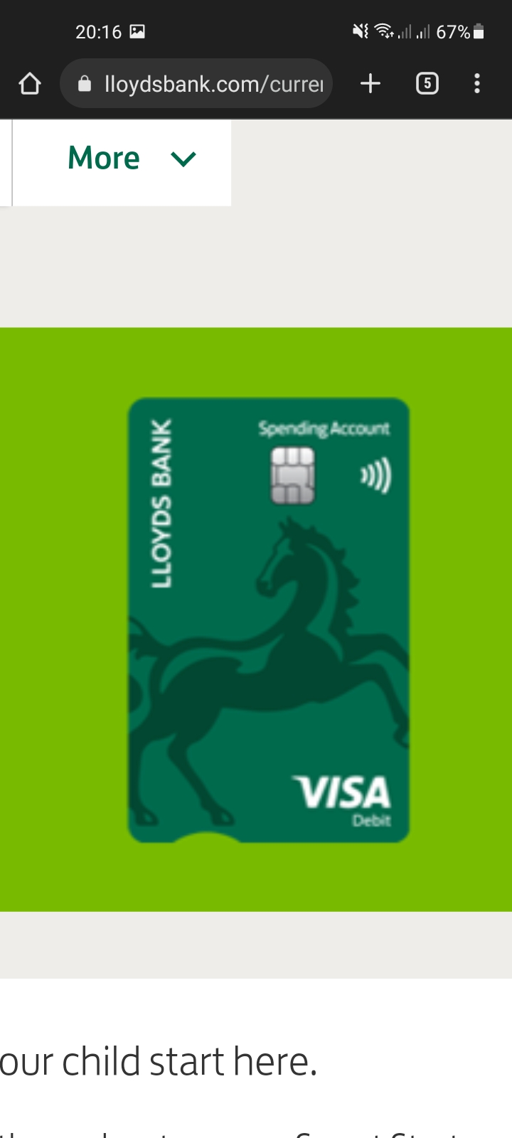
Lloyds do have a new design for their Smart Start account and Im fairly sure Halifax’s equivalent account were the first to get their new design so I assume it will be rolled out to their other cards at some point.
3 Likes
Oh, I hate it! at least scale the horse correctly! I worked for them for 7 years before being laid off, I saw that logo everyday ![]()
1 Like
Hopefully the black horse will be spot varnished like both the Halifax and Bank of Scotland logos.
5 Likes
