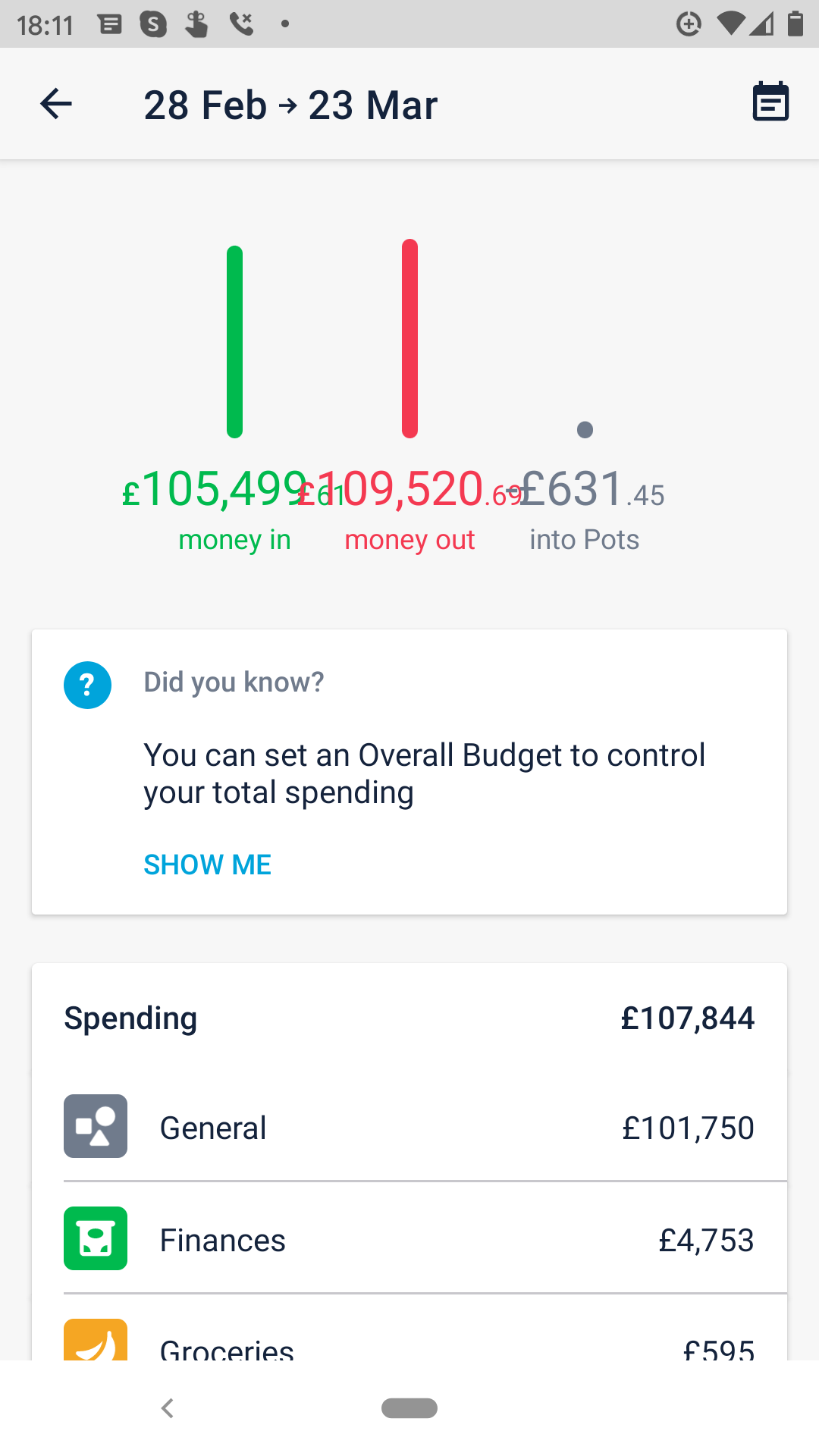
Issue:
Budget summary figures overwrite each other.
Details to reproduce:
Click on monthly summary/budget
OS:
Android 10
Device:
Google Pixel 2
App Version:
3.9
Screenshots:
Issue:
Budget summary figures overwrite each other.
Details to reproduce:
Click on monthly summary/budget
OS:
Android 10
Device:
Google Pixel 2
App Version:
3.9
Screenshots:
Ok, I’m sure we’ve all had an unusual month but it seems 6 figure numbers don’t work either! So that’s zero to 100k+ that doesn’t layout correctly.


