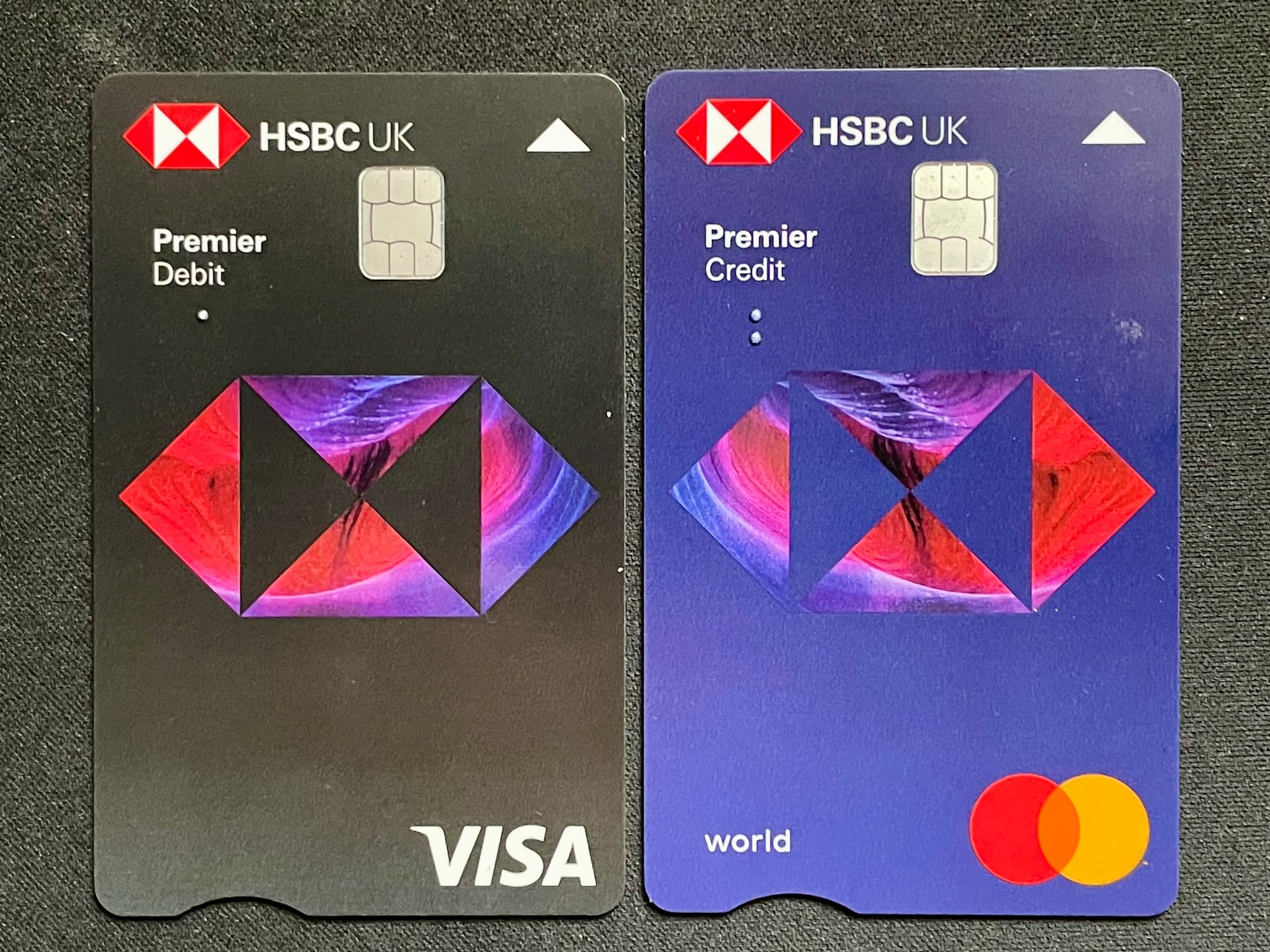
The HSBC one is ugly, but at least the front is a little cleaner. Imagine if you will, the coral card in the format of plus and premium? Now that would be worthy of featuring in social media ads!
I still don’t see the benefit of the small triangle. How this improves accessibility for the visually impaired, when the dirty great big chip in the same orientation is there, I don’t know.
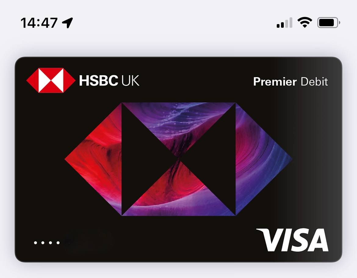
I’m hoping they update the Apple Wallet photos for their credit cards too cause the mismatch frustrates me. Also noticed the centred HSBC logo peaks out over the top on the new debit graphic.
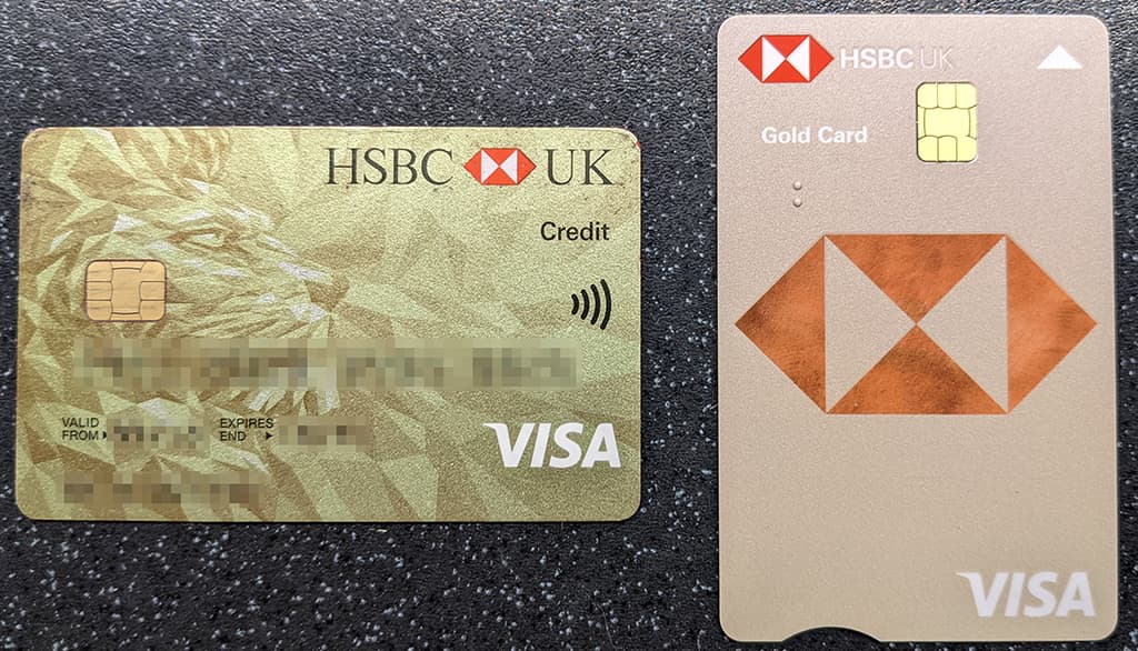
I just received my new HSBC Gold credit card (existing one nearing expiry). It’s about as far removed from Gold as I could imagine. More like matt sand, with a little straw thrown in:
For clarity, older Gold card on the left, new ‘Gold’ card on the right
I hate the 2-logo approach on the front. It’s a good looking card on the rear, flat numbers, expiry, CVV, contactless symbol, but the front - and the colour - thank goodness for Google Pay so I can ensure no-one sees me handling it.
Nothing really. Like the Advance account when it launched - offers, interest, perks. One-by-one, year-by-year, they all evaporated.
Every cloud though, the silver lining here is that I was a long term user of a bundled bank account.
Just like PPI and DieselGate, keep them historical records safe… just in case.
I think the Premier and Advance designs look better, largely because the black background is more forgiving.
The standard design for all other accounts grates on me massively and I really don’t like it. Especially when the lions design looked so good even with a grey background.
Users of the new beta HSBC app (@SebH@mariusfanu@jtame), does it still only show you 6 months worth of transactions, or has that been addressed? It’s always something that really annoyed me about HSBC’s mobile app and online banking!
Im really disappointed HSBC stopped their old card designs, they really was unique and had good brand image, the coloured borders were cool also. Im not a fan personally of their new branding. they even feel cheap and poor quality
I misremembered, it was 6-8 weeks, not 6 months (even worse!). And that’s really disappointing to hear that it’s not something they’ve addressed in the new app. I find it so old fashioned to have to go rummaging through actual PDF bank statements to find a transaction nowadays! It should just be a quick search away. My other high street banking apps allow me to go back as far as I want in my transaction feed, and they’re both using much older systems than HSBC (NatWest and Lloyds), so I wonder why on earth HSBC is like this?

 The cards look nice and clean