Swole is a horrible word. As is the toxic masculinity it’s attached to.
3 Likes

For right–handed folk, using a horizontal wallet, the name of the bank is completely in the wrong place (and it’s not visible in vertical wallets either).
What a weird choice.
6 Likes
Yes, this is one of the things I like about HSBCs cards, In vertical wallets the logo is typically visible as is the bank name.
1 Like
At least you can read it in your wallet though
2 Likes
I guess with Lloyds there aren’t too many dark green cards to get confused with?
¡snoᴉɹɐlᴉɥ s,ʇɐɥ┴
3 Likes
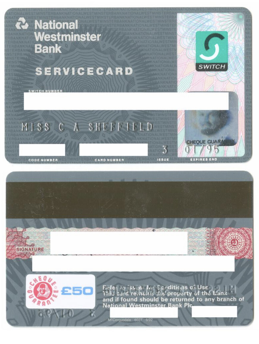
My first debit card, issued when I was 16, in the pre–Solo days. I really loved that design, and the giroscope pattern was replicated across the statements and chequebooks. I felt very grown–up moving to London for the beginnings of my career that summer.
5 Likes
Who’s the person on the card?
Also, I found this on google.
https://colnect.com/en/bank_cards
What fresh hell have I unearthed
1 Like
Miss C A Sheffield.
7 Likes
Found my very first solo card

6 Likes
That’s taking me back, this was my first card as well when I was a teenager and getting paid EMA.
2 Likes
I remember paying for a chocolate bar with it and thinking I was pretty cool.
And then waiting for the post with the bank statement, cos the Nokia 5110 didn’t do banking apps!
I miss the simplicity of those times
2 Likes
Used to have sortcode and account number as card number ![]()
Does anyone have the NatWest rewards black credit card?
Had to download Mastercard rewards app to check my welcome bonus! Oh how good does that red lion card look!

4 Likes
That app is so bad. It’s one that’s written in javascript and compiled to a native app, the scrolling on the list of reward partners is very buggy and difficult to properly scroll through.
1 Like

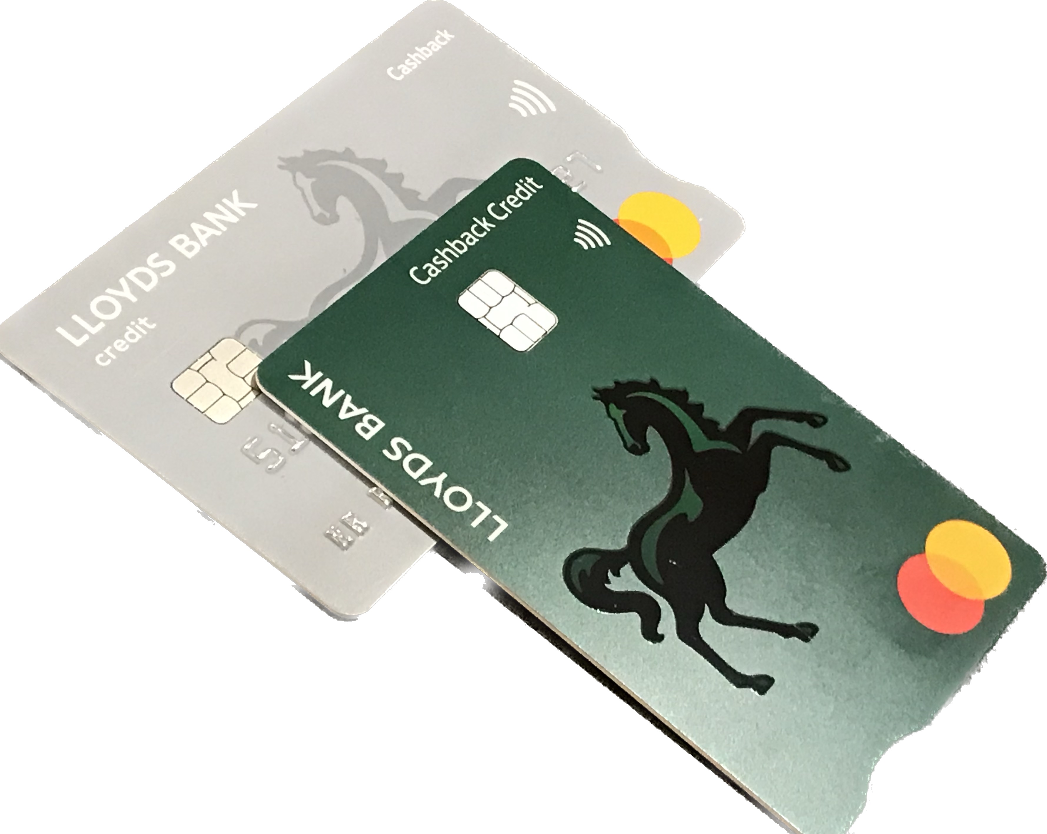
Had my Lloyds Cashback Credit card replacement arrive. The old pale grey has become Matt green with glossy logo. Plain white core though which is a shame.
7 Likes
Apparently RBS reps on Twitter are suggesting that they’ll have a new card design to match the rebrand… I don’t even have a beach hut yet!
Though in all honesty it’ll probably just be the purple app icon instead of the blue corner
2 Likes
Could brand harmonisation potentially ring the death knell for the Child & Co and Drummonds sub-brands?