App Evolution (new look Monzo app): Feedback Megathread 📣

Hello! It’s me again :wave:t2:.

Building on yesterday’s exciting news, of mortgages in Monzo and a better way to budget, I’m back with the other thing you all wanted to hear: an early version of Overview, the new Home screen that the App Evolution team have been working on, is now live in Monzo Labs!

We’d love for you to try it out and give us feedback. This is still a relatively early version, but we wanted to get it out there as soon as we felt it was good enough for some wider input.

:running_woman:t2: How to get it

You’ll need our most recent app release, v5.4.0 which shipped yesterday to the App and Google Play Stores.

Once updated, go to SettingsMonzo Labs, enable the Overview ✨ option, then restart your app.

There’s a feedback form embedded in the screen for in-app feedback; for anything longer form you can of course post your thoughts on this thread!

:nerd_face: Deep dive

As a bit of a recap, Overview is designed with a few core things in mind:

  • Focusing on customer core jobs and key actions — core day-to-day jobs should be easy. We’re a bank: ongoing account management should be easy.
  • Creating clarity with balance data and prompts — what’s on this screen should be clear and easy to understand, and if there are things to do (e.g. move money to prevent you from going overdrawn), these should be obviously highlighted.
  • Taking customers on a journey as our offering evolves — we wanted to build something modular, that scales up or down well depending on how engaged you are with Monzo.

To this end, we’ve built quite a few new components to try and set us up for success:

It’s worth noting at this point that we’re aware we haven’t realised all of these things yet. We’ve been focusing on building foundations that we, and other teams at Monzo, can build on. Stay tuned for more polish, functionality, etc over the coming months.

We’re releasing now to the community to get your input on how these foundations work for you, and to help us prioritise what’s most important to you next!

Full account widget

See your account details, current balance, and relevant actions to do the core day-to-day jobs you need to do. For example, get a bank statement, share your account details.
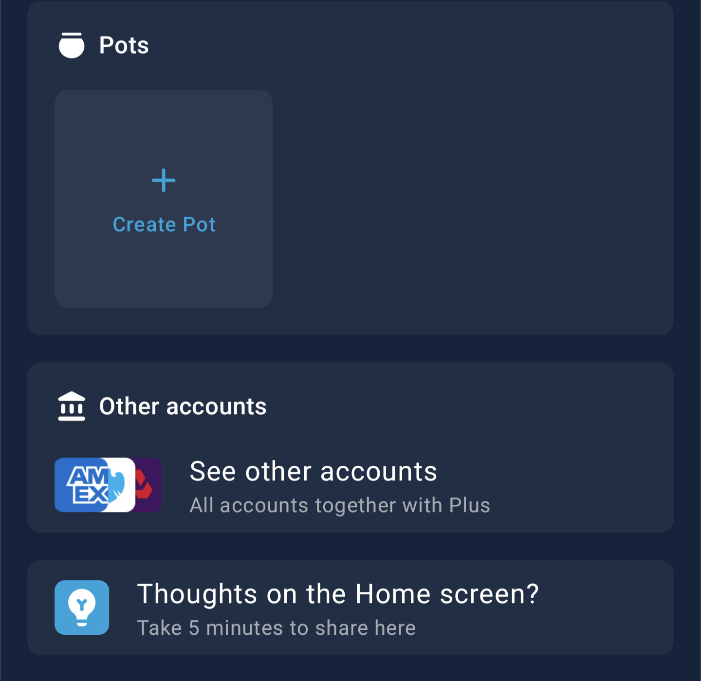
Add product menu

Each account has a menu to contextually show key actions you can take with that product or service. For example, create a Pot or Savings Pot.

Latest Activity

Bring together your finances and see your latest transactions and other feed items, across all of your accounts, in one place.

Note: we envision this to be across Monzo accounts, external accounts, virtual cards, Pots etc, but it isn’t all there today. We’re working on it!

Mini account widget

There’s a few potential usages of this widget, we’ve started out with using it to show Pots — across your personal and joint accounts.

:eyes: Behind the scenes

As mentioned, this is all still very much under active development. If you keep the flag on, you’ll see us iterate on the experience, as we ship things each week!

We have quite a lot planned for our next milestone, but to give a lil sneak peek of some of the priorities:

  • Improving how you access cards/card details — it’s a bit clunky at the moment, we know we can do better here!
  • Polish — we haven’t put very much time into animations or anything yet, we will! Most notably, bringing across the balance ticker animation when your balance updates
  • Glanceable insights — that do the heavy lifting for you by surfacing useful information
  • Enhancing Latest Activity — as I noted above, bringing more types of account, as well as other improvements like badges to bring clarity to this section

🫵🏽 Over to you

So, now, over to you all! Turn it on, and let us know what you think. The whole team will likely be refreshing this thread to see what you make of it :popcorn::joy:.

65 Likes

Turned on straight away - first impressions, a big improvement! looking forward to playing around with it more.

21 Likes

Oh my.

15 Likes

@Peter_G is going to combust with all this new!

Turning on now!

16 Likes

So what I really do hate, hopefully these can be dismissed and removed totally, or moved lower down so it’s out of the way.

8 Likes

oooo, nice, one thing for me on first view, on my current widget, it comes up with ‘Add money’ when it would be more useful to have the ‘move money’ option to make a Faster payment etc

6 Likes

I can’t see how to unhide my hidden pots! So I guess I won’t be tempted to take money from them as they are gone all together :laughing:

4 Likes

I’m probably just going to brain dump as I spot things;

Not sure on this blur? It probably works for the standard pictures, but not so keen on this

Also, the total for the pots adds personal and joint together. While technically I know it is my money, I’d like to know that MY pots = £xx and OUR pots = £xxx, not just pots = £yyy

16 Likes

@Revels we should have a TestFlight build out later today which refines the blur a bit more, the version on 5.4.0 blurs too much of the original image and also has a little bug as well

12 Likes

Oh good, because Terry here looks like he’s melting. You should see the image with my son in it too :melting_face:

I’m a big fan of the new look so far though, but I’ll reserve more feedback until I’ve used it a little more.

13 Likes

If you click on the pencil edit icon at the top, it displays a message saying it needs to be edited in legacy mode for now, to unhide them.

5 Likes

Here’s how the Pot looks in 5.5.0
IMG_A80C0506BC77-1

On 5.4.0 the way it’s implemented is having two images: one blurred in the foreground and one unblurred in the background, but the foreground one gets squashed (which is why you can see the Amex logo in @RichardL’s screenshot).
5.5.0 just creates a single image which is more performant, and was actually an approach suggested to me by ChatGPT because it mentioned an image filter I wasn’t aware of!

9 Likes

That’s good to know thank you! So this is kind of an early release to allow us to look at the thing but I probably won’t leave it in this mode a lot.

4 Likes

Out of interest what features from the old Home would make you want to change it back?

3 Likes

I like being able to see the value of all my pots in Monzo and the total value of my linked accounts. As a quick “this is how much I have collectively” check.

So with my hidden pots missing and the linked accounts not totally up anywhere I can’t leave it on the new mode all the time.

I will maybe pop back and forth between them to see how it progresses :blush:

5 Likes

Good to know, thanks! We’ve got plans to fix those issues early next year

Regarding hidden pots being missing, you can show them again using the pencil icon at the top but we’re also going to be improving that soon as well

5 Likes

My first thought is that it’s much easier to see all my things with Monzo without having to swipe all over the place. That said, because I don’t have Plus, Flex, Loans or Overdrafts it feels like the whole thing is designed to sell me stuff. It’s my account, then “here’s a loan!” “Get Plus to connect other accounts!” “Fancy Flex?” Before I finally get to the end where my mortgage is and the “Do more with Monzo” section.

Would be good to intelligently hide sections or to allow people to hide them.

Otherwise this is a huge improvement over the old Home Screen

16 Likes

Love this.

What a day to be here! :nerd_face:

My critique initially is just getting my Amex showing in my latest activity as well as Monzo but I can see that’s in the works already.

The bottom half (after virtual cards) is a bit of a mess though. They are all things you can do elsewhere (open a pot etc) and loans could really go elsewhere too.

That being said you’re a bank and need to make money so if the price we pay is that then so be it.

Also… I tap on Monzo Flex at the top and the card sort of slides down for a little more info. Instinctively to retract that card back I tap again but it brings me into my Flex account screen.

Fair enough maybe.

But then I try to swipe up to retract it and it doesn’t do anything. I have to scroll down so the account widget isn’t on screen and go back up to reset the widget. Feels a tad clunky.

9 Likes

Looks good!

  • I’d like the ability to change the order of the categories which looks like it’s coming

  • I think the Activity fees could do with being a tab rather than breaking up my accounts. Maybe the star at the top could replace the Plus tab at the bottom and you could advertise Premium down in the feed

  • I don’t think the Pots images work, it looks too cluttered

  • The pots are totalled, why not the accounts and pots at the top too?

I’d love to see a comparison of how the app started the year vs ended it, there must have been a lot of change that I haven’t appreciated

Seeing as I’m here could I get the option to set up a three weekly subscription for my coffee rather than weekly, fortnightly or monthly. Ta!

1 Like